✍🏻 Pen & Paper
15 Jan 2021
Well, I’ve finished my iOS course. Now, it is time to build my first app! Let’s get coding, right? Wrong.
One of the things I learned in the course was about how important it is to design your app with good ol’ fashioned pen and paper before coding anything up. This is because coding is much more time- and labor-intensive that simply drawing. It is also much harder to fix mistakes or change things in your design once you’ve put it into code.
That said, I grabbed an empty notebook (one with turtles on it that Ayana had bought for me for Christmas) and set to work.
User Flow Diagram
The first thing I did was draw a user flow diagram. This is a diagram that uses rectangles to represent different screens/menus/etc. in your app and uses diamonds to connect them (representing actions). It tells the story of how a user moves through your app and forms the basic blueprint for your app’s navigation.
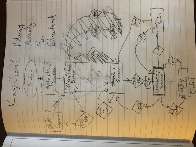
Above, you can see the messiness that is my user flow diagram! It’s a pretty simple app, with just a splash screen, a main menu, a levels screen, and a crossword screen where the user will spend the majority of their time.
I also added to the diagram a stats screen, a summary screen (for after finishing a crossword), and a settings screen, but I’m not going to implement those until after I get the main ones in the middle designed and coded up first. I’ve read that it’s important to get a minimally viable product built first and then go from there based primarily on user feedback.
App Title and Logo
I first spent some time coming up with an app title and logo while working on the splash screen and main menu. Here are my logo ideas:
![]()
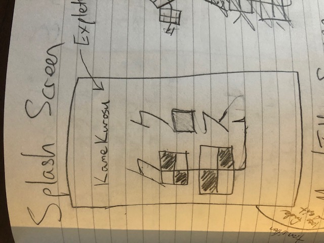
While thinking about logos, I also settled on the name KameKurosu. Kame (pronounced kah-meh) means turtle in Japanese, and if you know anything about me, you know I love turtles. Kame, which is written as 亀, has elements that sort of look like a grid, or a crossword puzzle! That led me to call the app KameKurosu, where Kurosu (pronounced ku-roh-su) means “cross”, short for crossword. In Japanese, you would write KameKurosu as 亀クロス (note that Kurosu is written in katakana since it originates from the English word, cross). To put this all into a nice, square logo, I made クロス vertical (often, Japanese text is written vertically) and centered above the “tail” of the turtle kanji. This then became the logo which I used on my drawn splash screen:
Main Screens (Views)
Following my user flow diagram, I started drawing out each screen (also known as “views” in coding lingo). Here are the results:
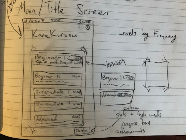
The main menu is fairly simple, with a button for each difficulty level of crossword, from beginner to advanced. I also want to include a settings menu (top right) as well as a statistics view (lower right).
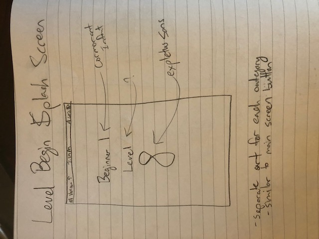
The splash screen is going to be pretty simple for now with the difficulty name and the level number, although I might have some catchy art made for this in the future.
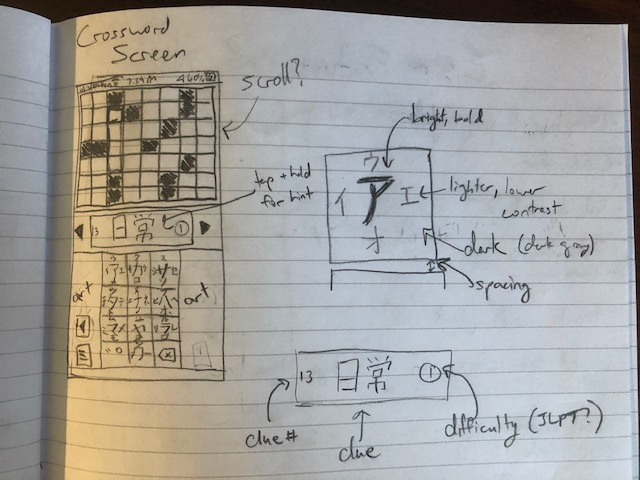
The main view! When doing a crossword, the crossword will be at the top and take up the entire width of the screen (no need to pan around). The clue will be prominently displayed in the middle, with arrows on each side that you can tap to quickly go the previous or next clue. You will also be able to tap on the crossword itself to select a clue, as you would expect. Finally, the bottom area will be reserved for the keyboard (Japanese-style), where you hold and swipe a specific direction on one of the squares to input a specific character. I’ll also include some art to fill in the sides (maybe a turtle?), since Japanese keyboard are more vertical than horizontal, unlike Western keyboards. Finally, I’ll include a few buttons on the left side of the keyboard that you can tap for things like hints, to go back to the main menu, etc.
Clues
In the main view, above, the clue is 日常 (nichi-jou), which translates to “everyday” and is a common kanji compound word (it contains the two kanji, 日 and 常). However, as I was thinking about clues, I realized there are many words in Japanese that contain kanji but also hiragana (this primarily occurs in Japanese verbs). Take the word for “to teach”, 教える (oshi-e-ru), for instance. It contains the kanji, 教, as well as the hiragana, え (e) and る (ru). In order to include these types of words as well which have both the hard-to-learn kanji as well as the easy-to-learn hiragana, I came up with the following scheme:
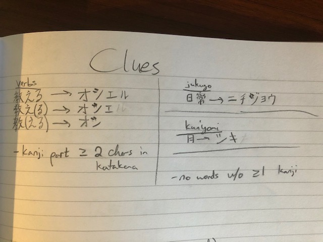
In this scheme, I add parantheses to the clue around the hiragana that are part of the actual word but aren’t going to be included in the answer. This (1) creates more possibilities when creating puzzles (especially important as Japanese verbs tend to end in just a handful of hiragana, especially る as in 教える), (2) makes it so we still need to know the kanji reading to solve the clue, and (3) when the hiragana are not in parantheses, gives the user a “free” character or two to fill in the puzzle, as the user should be able to read hiragana very easily. This last point could help the user figure out potentially difficult cross clues containing those squares.
I also noted (literally) to only build puzzles with words with at least one kanji (words without kanji exist but would defeat the purpose of the app) as well as at least a 2-syllable reading, since the minimum answer length in crosswords is two characters.
Hints
Finally, I thought about the type of hint system I might like to have. The simplest hint system would just involve revealing the reading one square at a time. I’m guessing this is what I will start with. I could always improve it in the future. One initial idea for improvement I had was the following:
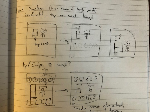
where the answer is revealed in a gamified, gradual way based on user input. But like I said, I’m probably not going to worry about this in the first version of the app.
Fonts
Another thing I did in the design stage was decide on a consistent set of fonts and colors for the app. For the fonts, I used Google fonts to help me choose. I ended up choosing a font that reminded me of bamboo for the title - Expletus Sans:

For the headings I decided on a serif font - Cormorant Infant:
And for contrast, for the subheadings and text I chose a non-serif font - Athiti (which apparently means “sun” in Thai?):

I might make the cormorant infant font a bit bolder and the athiti font a bit lighter. I’ll play around with it until I find something I like when I start developing the app.
Colors
For the colors, I used colormind.io, which uses artificial intelligence (AI) to select colors for you based on colors you have already selected. I wanted a sea green color to go with the turtle aesthetic. I then just randomized the other colors over and over until I arrived at a color palette I was satisfied with. This is the palette I ended up with:
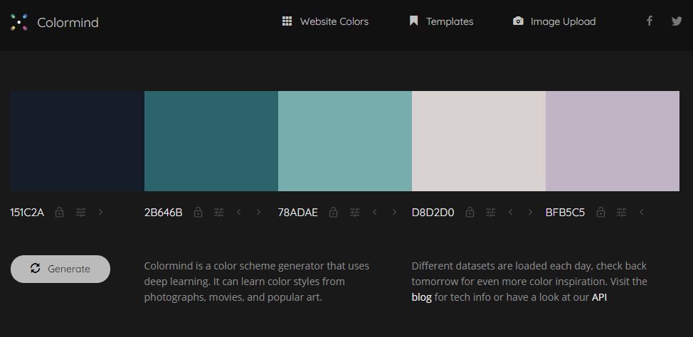
I’m thinking I’m going to use that purple as sort of an accent and text color, the grey/white for the crossword background, and the other colors for UI element backgrounds and such.
Summary
Overall, I’m pretty happy with these initial sketches and design choices! I was able to:
- create a basic user flow diagram
- come up with a fun title, “KameKurosu”
- design a logo that matches a turtle + crossword theme
- draw up initial ideas for what I want each view to look like
- and come up with some nice fonts and a pretty color scheme