🍱 Coding up the UI: Part I
09 May 2021
Now that we have all our data into our app, we can actually make our app come to life!
Here I build the main menu screen and add some basic navigation to the level splash screen and crossword screen (and then back to the main menu). I also added a splash screen with the KameKurosu logo for when the app is loaded up. I worked all weekend on this, but I’m pretty satisfied with the final result!
Menu Screen
The first view (screen) I started working on was the main menu because that will be the app entrypoint (after a splash screen which I’ll make later). Also, the main crossword view will be the hardest one to code up, so I figured it’d be best to start with something easier.
I first looked at my mockup to remind myself what this view needs to look like:
I decided to split it up in 3 main sections:
- Title and settings button
- Main menu
- Footer with turtle art and side text buttons
In SwiftUI one of the cool things is that you can have “Views” within “Views”. this means I could create just the settings button in a single SwiftUI file, annotated as a View.
I can then load this View in the Main Menu View at the top. Similarily, I can create a menu button View and reuse it for each button!
Here is a View hierarchy of what I’m thinking for the Main Menu and all its subviews:
- Main Menu View
- Top View
- Settings Button
- Title Text
- Menu View
- Accented Border
- Menu Button List
- Single Menu Button
- Footer View
- “How it works” Text Button
- Turtle image
- “Want more puzzles” Text Button
- Top View
Now that I have a plan, I can create and code up a separate SwiftUI file for each of these views. Each of these 12 view files will connect to eachother to produce the full layout.
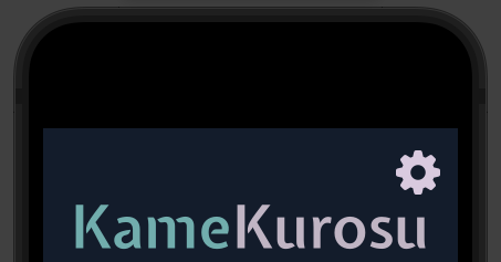
Title Text
I started on the Title Text because I figured it would be the easiest thing to do first.
I first had to load in my title font, Expletus Sans, into Xcode. I also loaded in the other fonts I knew I would need at this point (Athiti, Cormorant Infant).
Then I wrote a small view to display this text. I used an HStack to horizontally stack the “Kame” and “Kurosu” parts of the word so that I could color each separately:
struct TitleView: View {
    var body: some View {
        HStack(spacing: 0) {
            Text("Kame")
                .font(Font.custom("ExpletusSans-SemiBold", size: 54))
                .foregroundColor(Color("BlueLight"))
            Text("Kurosu")
                .font(Font.custom("ExpletusSans-SemiBold", size: 54))
                .foregroundColor(Color("PurpleLight"))
        }
    }
}
Note that because I’m using custom colors, I had to add these manually in Xcode.
The view looks like this in the preview:

I can now just call TitleView() to put this view anywhere in my app (e.g. on splash screen, main menu, etc.).
Settings Button
Next, I wanted to tackle the settings button. After that, I could combine it with my title view to make the top portion of our main menu view.
I knew I wanted it to look like a gear, but I didn’t want to make a gear shape line by line. It turns out there is a whole set of symbols that you can use in your apps called SF Symbols! I just grabbed one of these (“gearshape.fill”), and it worked perfectly. I then wrapped it in an HStack and added a Spacer to the left side to push it to the right, code below:
struct SettingsButtonView: View {
    var body: some View {
        HStack() {
            Spacer()
            Button(action: {
                print("Going to settings menu")
            }, label: {
                Image(systemName: "gearshape.fill")
                    .resizable()
                    .aspectRatio(contentMode: .fit)
                    .frame(width: 40, height: 40)
            })
            .padding(.horizontal)
        }
    }
}
It doesn’t actually do anything yet - just prints “Going to the settings menu” to the debug console when you tap it. Eventually, I’ll replace it with logic to actually go to a settings menu (which I have yet to create).
But here is what it looks like so far:

Combining these in the top view
I then combined these in my overall view for my Main Menu by using a Vertical Stack (VStack):
struct MainMenuView: View {
    var body: some View {
        ZStack {
            Color("BlueDark")
                .ignoresSafeArea()

            VStack(spacing: 0) {
                SettingsButtonView()
                TitleView()
                // MenuView()
                // MenuFooterView()
                Spacer()
            }
        }
    }
}
And it looked great!
Menu Footer
I wanted to hold off on the main menu part because I figured it would be the most challenging, so I worked on the footer next.
Here I had 3 elements in a row to create, the two text buttons and the turtle art in the middle, so I used an HStack to arrange them.
It took a while to figure out how to make the text wrap (originally it was just going off the screen) as well as make the text “tappable” as a button, but after I figured that out, it looked pretty good (code below)!
struct MenuFooterView: View {
    var body: some View {
        HStack(alignment: .center) {

            HStack {
                Spacer()
                Button(action: {
                    print("Going to how it works")
                }, label: {
                    Text("How it works")
                        .foregroundColor(Color("PurpleLight"))
                        .font(Font.custom("Athiti", size: 20))
                        .multilineTextAlignment(.center)
                })
                Spacer()
            }

            Image("Turtle")
                .resizable()
                .aspectRatio(contentMode: .fit)

            HStack {
                Spacer()
                Button(action: {
                    print("Going to want more puzzles?")
                }, label: {
                    Text("Want more puzzles?")
                        .foregroundColor(Color("PurpleLight"))
                        .font(Font.custom("Athiti", size: 20))
                        .multilineTextAlignment(.center)
                })
                Spacer()
            }

        }
    }
}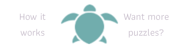
And after adding this into the overall view at the bottom, we have…
Looks pretty good so far! Thanks again to Peter for the nice turtle art! Now for a harder challenge…
Menu and Buttons
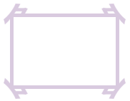
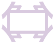
The first thing I worked on here was the light purple menu border. This was a bit challenging because I wanted to make it as scalable and adjustable as possible since I wanted to use it in multiple places in my app, like in the two mockups below:
I ended up having the view for this border take in a scale factor as an argument which it then uses to scale the corner accent pieces. I then used a rectangle (border only) for the horizontal and vertical lines.
For the corner accents, I had to learn how to rotate and reflect them - it turns out you can use .rotationEffect() to rotate an image or .rotation3DEffect to rotate & reflect an image, as shown in the code below.
I used the scale factor to scale the size of the border accents. I also had to (through trial and error) use a multiple of this scale factor to adjust the thickness and padding of the vertical and horizontal lines, so that they would move inward, for example, if you increase the size of the border accents (and vice versa).
struct AccentedFrame: View {
    let scaleFactor: CGFloat

    var body: some View {
        ZStack {
            let thickness: CGFloat = 5 * scaleFactor
            let borderAccentScaled = Image("BorderAccent")
                .scaleEffect(scaleFactor, anchor: .topLeading)

            VStack {
                HStack {
                    borderAccentScaled
                    Spacer()
                    borderAccentScaled
                        .rotation3DEffect(
                            Angle(degrees: 180),
                            axis: (x: 0.0, y: 1.0, z: 0.0)
                        )
                }
                Spacer()
                HStack {
                    borderAccentScaled
                        .rotation3DEffect(
                            Angle(degrees: 180),
                            axis: (x: 1.0, y: 0.0, z: 0.0)
                        )
                    Spacer()
                    borderAccentScaled
                        .rotationEffect(Angle(degrees: 180))
                }
            }

            Rectangle()
                .foregroundColor(.black.opacity(0.0))
                .border(Color("PurpleVeryLight"), width: thickness)
                .padding(.vertical, 14 * scaleFactor)
                .padding(.horizontal, 9 * scaleFactor)
        }

    }
}
Here is a preview for scale factor of 2.0 (left) vs 4.0 (right) with a set height and width:
Lookin’ good! Especially considering all I now have to do is change a single number.
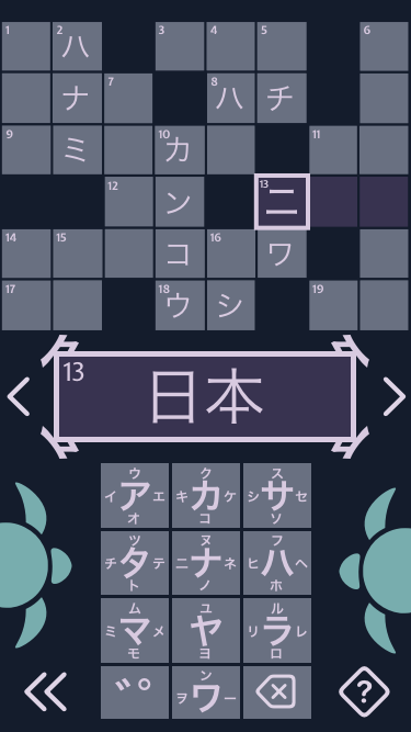
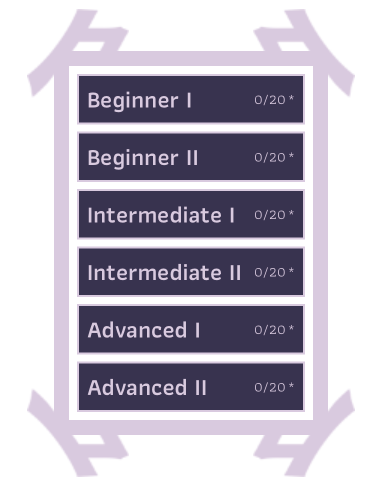
I then set to work on the stuff that goes inside this border. Specifically, it needs to contain 6 buttons, one for each level. Each button will have some text saying the level name, number of puzzles completed, and number of puzzles unlocked. Because each button is basically the same layout, I created a single view and reused it.
Each of these buttons takes in a single argument, level. This is so that button can display information for that level. I also added some logic to adjust the font sizes and add an asterisk if the user hasn’t bought all the puzzles for that level.
struct MenuItemView: View {
    let level: Level

    var body: some View {
        // Get current level from currentPuzzleID (e.g. "1-0017" -> "0017")
        let currentPuzzleString = level.currentPuzzleID!.split(separator: "-")[1]
        // Remove padded zeroes
        let currentPuzzleNumber = Int(currentPuzzleString)!
        // Number completed levels
        let nCompleted = currentPuzzleNumber - 1

        Button(action: {
            // Go to level splash screen here
        }) {
            ZStack {
                Rectangle()
                    .foregroundColor(Color("Purple"))

                HStack(spacing: 2) {
                    let fontSize = CGFloat(24.0)

                    Group {
                        Text(level.name!)
                            .font(Font.custom("Athiti", size: fontSize))
                            .fontWeight(.bold)
                        Spacer()
                        Text("\(nCompleted)/\(level.npuzzlesUnlocked)")
                            .font(Font.custom("Athiti", size: fontSize * 0.6))
                        if level.npuzzles > level.npuzzlesUnlocked {
                            Text("*")
                                .font(Font.custom("Athiti", size: fontSize * 0.6))
                        }
                    }
                }
                .padding(.horizontal, 10)
                .foregroundColor(Color("PurpleVeryLight"))
            }
            .border(Color("PurpleVeryLight"), width: 2)
        }
    }
}
Looks pretty good if I do say so, myself.
Now I just had to put this all together! I first combined the border frame with the 6 level buttons in the middle, using our previous two views we made.
I first do a FetchRequest to get a list of all the levels from the Core Data database. I then loop through each of these levels in a ForEach block and create a MenuItemView (which we just built above) for each level. I had to adjust the spacing and padding a bit, but eventually I got it to look pretty good!
struct MenuView: View {

    @FetchRequest(entity: Level.entity(), sortDescriptors: [NSSortDescriptor(keyPath: \Level.id, ascending: true)]) var levels: FetchedResults<Level>

    var body: some View {
        ZStack {
            AccentedFrame(scaleFactor: 3.0)
                .frame(maxWidth: .infinity, maxHeight: .infinity, alignment: .center)

            VStack(spacing: 7) {
                ForEach(levels) { level in
                    MenuItemView(level: level)
                        .frame(maxWidth: .infinity, maxHeight: .infinity)
                }
            }
            .padding(.horizontal, 50)
            .padding(.vertical, 65)
        }
        .padding(.horizontal, 20)

    }
}
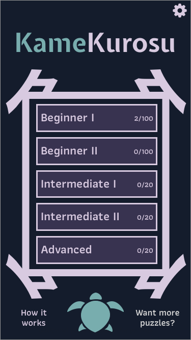
Combining It All!
Finally, the moment you’ve all been waiting for! Combining everything into one screen!
The code is quite simple since we’ve done all the hard work in each of their respective files:
struct MainMenuView: View {
    var body: some View {
        ZStack {
            Color("BlueDark")
                .ignoresSafeArea()

            VStack(spacing: 0) {
                SettingsButtonView()
                TitleView()
                MenuView()
                MenuFooterView()
                    .padding(.bottom, 20.0)
            }
        }
    }
}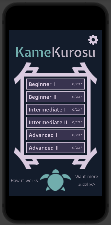
Looks great (it’s not actually as blurry as it looks in this image)! The next thing was to focus on building the next screen - the level splash screen that pops up for a few seconds before each level (and right after you click one of these menu buttons).
Level Splash Screen
I first looked at my mockup for this screen to remind myself of what it needs to look like:
It looks like we can just make 3 subviews and combine them:
- Level Splash Screen View
- Level name
- Big number
- Turtle image
Simple enough, right?
Level Name
I started on the level name, and it turned out to be quite simple:
struct LevelNameView: View {
    let currentLevelName: String

    var body: some View {
        Text(currentLevelName)
            .font(Font.custom("Athiti", size: 54))
            .fontWeight(.bold)
            .foregroundColor(Color("PurpleVeryLight"))
            .lineLimit(1)
            .minimumScaleFactor(0.1)
    }
}
It’s just a Text element with a bunch of modifiers. I learned about and added .lineLimit and .minimumScaleFactor to force the text to shrink if the screen isn’t wide enough (e.g. on the iPhone SE). Here’s a preview:

Big Number
I thought this part would be pretty straightforward - just write a number using Text with a huge font size and then add a border to it… however, it turns out you can’t add borders (strokes) to text in SwiftUI. You can in the old framework, UIKit, and while it is technically possible to mix the two, I didn’t want to go down that road.
After thinking about this for a few minutes, I realized I could at least make it look like a shadow rather than an outline by just creating 2 big numbers on top of each other, with the one behind slightly offset to the lower right. I learned that you can translate elements using .transformEffect, as shown in the code below where I translate it 5 pixels right and down:
struct BigPuzzleNumberView: View {
    let puzzleNumber: Int

    var body: some View {
        ZStack {
            Text("\(puzzleNumber)")
                .font(Font.custom("Athiti", size: 295))
                .fontWeight(.bold)
                .foregroundColor(Color("PurpleVeryLight"))
                .transformEffect(CGAffineTransform(translationX: 5, y: 5))
            Text("\(puzzleNumber)")
                .font(Font.custom("Athiti", size: 295))
                .fontWeight(.bold)
                .foregroundColor(Color("Purple"))
        }
        .frame(maxHeight: 230)

    }
}
The preview looks like this:

So not exactly what we were going for, but I think it actually looks just as good (maybe even better)!
Turtle Image
The last part of the level splash screen is the small turtle art at the bottom. This was super easy to put together since it is just a small image:
struct LevelSplashFooterView: View {
    var body: some View {
        Image("Turtle")
            .resizable()
            .aspectRatio(contentMode: .fit)
            .frame(maxWidth: 150)
    }
}
I added a maxWidth argument to the .frame so that it wouldn’t get too big on bigger phones.
Preview:

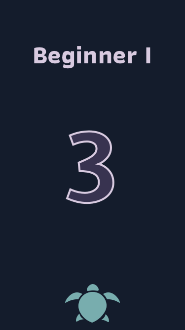
Finished Splash Screen
Finally, I put it all together!
struct LevelSplashView: View {
    var body: some View {
        ZStack {
            Color("BlueDark")
                .ignoresSafeArea()

            VStack{
                LevelNameView(currentLevelName: "Beginner I")  // change this to show tapped level
                BigPuzzleNumberView(puzzleNumber: 1)  // change this to show puzzle number for tapped level
                Spacer()
                LevelSplashFooterView()
            }
            .padding(.top, 50)
            .padding(.horizontal, 50)
            .padding(.bottom, 20)
        }
    }
}
Pretty simple when you have all your subviews already built, right?
Preview:
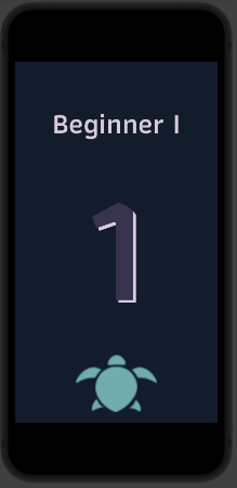
Next, I wanted to hook this view up to the previous view so that if you tap the “Beginner I” button on the main menu, you would see the screen above, and if you tap the “Intermediate II” button you’d also see the screen above but with “Intermediate II” instead of “Beginner I” displayed.
Navigation
So I’m not gonna lie, it took me a long time just to figure out how to navigate between screens effectively. Through a bunch of trial and error using different methods that I found online, I eventually settled on using an external library called NavigationStack. Once I used that, it just started to click and make sense.
If you don’t want to read about all the mistakes and frustrations with this, feel free to skip to the next subsection, Navigation Stack.
The first thing I tried was use SwiftUI NavigationLink elements to navigate between views. This is the “normal” way to do this if you are using SwiftUI.
However, it was really confusing to set up. I basically had to set up a variable to keep track of when each button was pressed. Then when that variable detected a press, it would trigger a NavigationLink to fire and take you to the specified next view. I scattered these NavigationLink elements all over my views (it looked pretty messy), but I was then able to successfully go from the main menu view to the level splash screen view, which was great!
The next step was to go to the Crossword View (which I hadn’t made yet) after a few seconds of showing the splash screen. To do this, I just made a blank view to temporarily act as my future Crossword View. I then added a timer to the splash screen to count down and trigger that navigation event. This also took an hour or so to figure out, but eventually I got it working.
At this point, everything was looking great! However, the last step made things super confusing.
Basically I wanted to just add a “back” button to my blank crossword view so that I could make sure I’m able to go back to the main menu from the crossword screen.
For whatever reason, this turned out to introduce a bunch of bugs into my code where, for reasons I couldn’t figure out, after I hit the back button I’d go back to the main menu (as intended), but then the app would just keep moving around from view to view on its own.
I then found a potential solution where instead of going back to the main menu, I just went back one screen at a time. This fixed the issue of the app doing weird things on its own. However, I don’t want to go through the splash screen on the way out of the crossword screen to the menu screen, only when entering the crossword screen…
Finally, I stumbled upon an external library developed by an iOS developer called Navigation Stack. This made everything work super smoothly and also made my code a lot more organized!
Navigation Stack
As I was reading about this tool, I learned that you can’t go back more than two views at once in SwiftUI without things getting weird. This apparently is just a limitation of SwiftUI at the moment - hopefully it improves in the future! This is possible in the old framework, UIKit, but, again, I didn’t want to mix the two.
After installing the Navigation Stack library into my app’s codebase, I started using it by following the online examples. Compared to NavigationLink, it was relatively easy to set up.
Instead of having NavigationLink elements scattered throughout my views, I just needed to push (or pop) a view onto the “Navigation Stack”. Basically you can think of the Navigation Stack as a stack of pancakes. At first, it starts empty. Then, when the app starts, the Main Menu view gets added as the first pancake. Then, when you tap on a level button, the Level Splash Screen View gets added on top of that pancake. Because it is now the top pancake, that is the view you see (with the Main Menu View still under it). Finally, after a few seconds, the Crossword View pancake gets added to the stack.
Now, the great thing about Navigation Stack, is that you can go back multiple views at a time. This is referred to as “popping” a View, as you “pop” it off the stack (but you can think of it as eating a pancake). This meant I could instantly “pop” the Crossword View and Level Splash Screen View from the stack to go back to the Main Menu View laying at the bottom of the stack.
Once I realized this, I quickly implemented it. Here is the final result!
Organizing my Navigation Code
One really nice thing about using the Navigation Stack was that I could put my navigation code all in one place, as shown in an example in the Navigation Stack repo.
class Router: ObservableObject {
    private let navStack: NavigationStack

    init(navStack: NavigationStack) {
        self.navStack = navStack
    }

    func toLevelSplashView() {
        self.navStack.push(LevelSplashView(router: self))
    }

    func toCrosswordView() {
        self.navStack.push(CrosswordView(router: self))
    }

    func popView(n: Int) {
        for _ in n {
            self.navStack.pop()
        }
    }
}
Now I can create a router, share it amongst my views that need navigation capabilities, and use it to modify the navigation stack.
For example, I could do
let router = Router()

// ...later on in my Main Menu Button code
router.toLevelSplashView()
when I press a menu button in the main menu to take me to the Level Splash Screen View.
I can also use my popView(n: Int) funcion to pop n Views off the stack (e.g. n=2 to go from the Crossword View back to the Main Menu View).
Using UserDefaults to Store State Data
One other thing I did was instead of using commonly used decorators like @Environment and @StateObject to save global state data, I realized I could store most of these properties in UserDefaults, which you can just think of as a built-in database for simple data like strings and numbers. This is important because I needed data persisted across all views, but after many hours of frustration I had realized that @Environment and the like only share data between subviews (i.e. connected in a tree like I made near the beginning for the Main Menu View and its subviews).
For example, I needed to tell the Level Splash View which Level button I had clicked on in the Main Menu View. These views aren’t subviews of eachother, even though they are next to each other on the Navigation Stack.
To save this information, I created a key-value pair for this in UserDefaults as follows:
UserDefaults.standard.set("Beginner I", forKey: "currentLevelName")If a button in the main menu got clicked on, it would change this value to the level name displayed by that button.
I could then read this value from any of the other views using:
UserDefaults.standard.string(forKey: "currentLevelName")!Pretty easy!
I eventually realized I had a few of these properties (in addition to “currentLevelName”, I had “currentPuzzleID” and “currentPuzzleNumber”). I knew I’d only be adding more in the future, so I decided to combine all these into a single object, which I called LevelStateUD (Level State UserDefaults).
I took advantage of some of my knowledge of computed properties to make changing and accessing them super easy:
class LevelStateUD {
    static let shared = LevelStateUD()

    /// Has the app been run before? i.e. have any UserDefaults been created?
    var initialized: Bool {
        get {
            return UserDefaults.standard.bool(forKey: "Initialized")
        }
        set {
            UserDefaults.standard.set(newValue, forKey: "Initialized")
        }
    }

    /// Current level name, e.g. "Beginner I"
    var currentLevelName: String {
        get {
            return UserDefaults.standard.string(forKey: "currentLevelName")!
        }
        set {
            UserDefaults.standard.set(newValue, forKey: "currentLevelName")
        }
    }

    /// Current puzzle number, e.g. 1
    var currentPuzzleNumber: Int {
        get {
            return UserDefaults.standard.integer(forKey: "currentPuzzleNumber")
        }
        set {
            UserDefaults.standard.set(newValue, forKey: "currentPuzzleNumber")
        }
    }

    /// Current puzzle ID, e.g. "1-0001"
    var currentPuzzleID: String {
        get {
            return UserDefaults.standard.string(forKey: "currentPuzzleID")!
        }
        set {
            UserDefaults.standard.set(newValue, forKey: "currentPuzzleID")
        }
    }

    /// Default values go here (set on the first time app is ever opened)
    init() {
        if !self.initialized {

            self.currentLevelName = "Beginner I"
            self.currentPuzzleNumber = 1
            self.currentPuzzleID = "1-0001"

            self.initialized = true
        }
    }
}
Now I can just do
LevelStateUD.shared.currentLevelName = "Beginner II"to update the current level name or
let myVar = LevelStateUD.shared.currentLevelNameto read the current level name.
Putting these properties in an object also allowed me to set default values for them (e.g. the first time the app is opened up) in the init() method at the bottom.
App Splash Screen
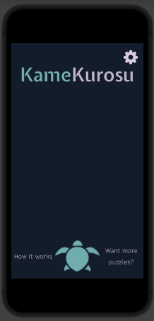
The final step for this initial work was to create the app splash screen with the KameKurosu logo that loads up when you open up the app.
This was much easier than the previous work since I’d learned so much already - it only took a few minutes!
struct AppSplashScreenView: View {
    let router: Router

    @State var timer = Timer.publish(every: 0.5, on: .main, in: .default).autoconnect()
    @State var remainingTime = 2.0

    var body: some View {
        ZStack {
            Color("BlueDark")
                .ignoresSafeArea()
            VStack {
                TitleView()
                Image("KameKurosuLogo")
                    .resizable()
                    .aspectRatio(contentMode: .fit)
                    .padding(.horizontal, 30)
                    .frame(maxWidth: 400)
            }
        }
        .onReceive(timer) { _ in
            self.remainingTime -= 0.5
            if self.remainingTime <= 0 {
                self.timer.upstream.connect().cancel()
                router.toMainMenuView()
            }
        }
    }
}
Here you can see how I am using the Router object as well as the timer to move to the Main Menu View.
Preview:
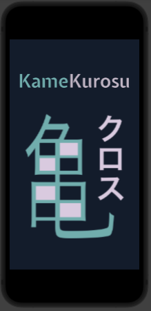
It looks a little blurry, so that might be something I need to fix in the future.
Summary
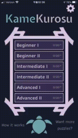
In summary, we now have a pretty slick looking app opening experience and menu system. Here is the final result!
We did a lot of things here!
- Made the Main Menu View and all subviews
- Made the Level Splash Screen View
- Added navigation using Navigation Stack
- Added a blank Crossword Screen View with a back button that takes you back to the Main Menu View
- Used UserDefaults to store some global state data that can be shared between views
- Made an App Splash Screen View with the KameKurosu logo that appears for a few seconds when you load the app
The next thing to work on is the Crossword View. This is by far going to be the hardest part since there will be so much logic involved. I think, though, that all the experience I gained from implementing these menus will definitely come in handy!
Eventually, I also need to do add other Views you can navigate to from the Main Menu View: the views linked to by the settings button, the “how this works” text, and the “want more puzzles?” text.