✍🏻 Fancy Pen & Paper
31 Jan 2021
The next step was to make more realistic-looking mockups. I used a program called Sketch (for Mac) to create all the mockups. Here are the results!
Mockups, Version 1
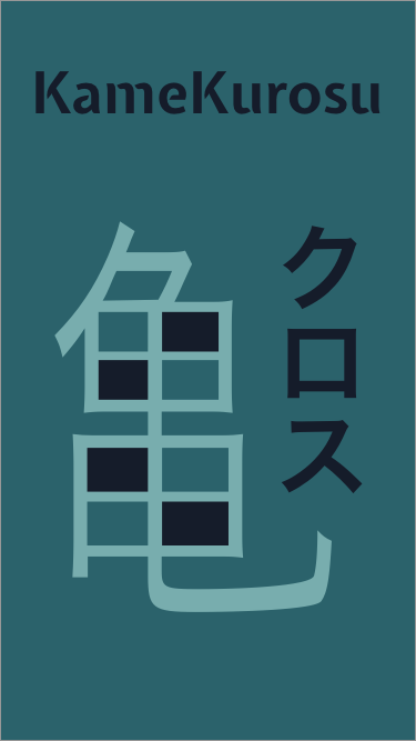
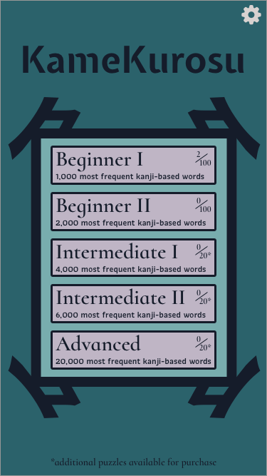
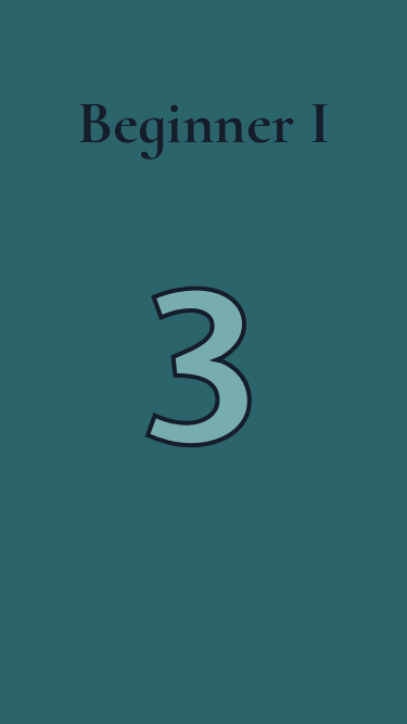
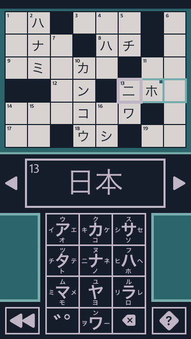
I basically just took my drawings (from the last blog post) and used Sketch to make each of these screens. Note that I changed a few things from my initial drawings as I was making these mockups, but overall they are very similar.
Mockups, Version 2
After I had these mockups done, I got a bunch of feedback from family and friends - thanks so much, guys! This led me to redesign each screen. I eventually settled on the following:
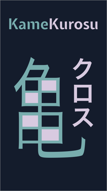
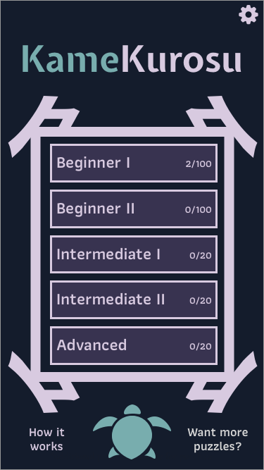
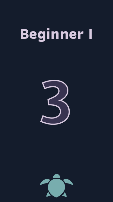
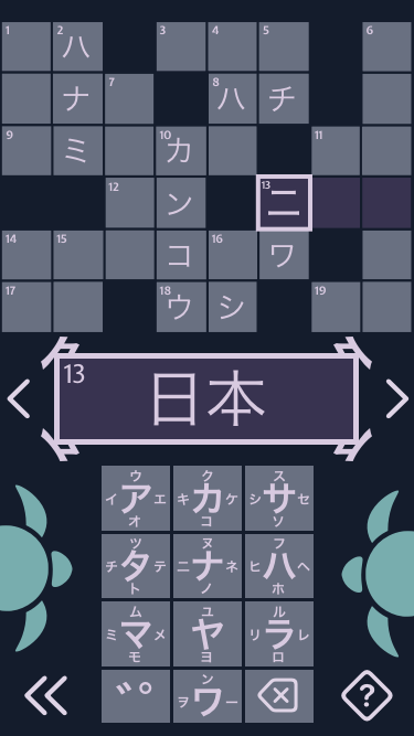
As you can see, it looks a bit more fluid, has some extra turtle art (thanks, Peter!), and while I didn’t change the colors used much, I changed how I used each color to make it pop a bit more.
Music
While I was getting feedback from friends/family, Isami (my awesome brother-in-law) offered to help out by creating some music and sound effects for the app. He’s a super musical and creative guy, so I’m excited to see what he comes up with! Having good music will definitely make the app more appealing to potential users.
Summary
That’s it! This has been a pretty short post - however, a lot of effort went into creating these mockups (around 20 hours or so). I’m really happy with how they turned out, though. Now that I have a good idea of how I want the app to look and behave, I can start getting more into the nitty gritty details of coding it up!